See Indicator Bundle to set up the Indicator Bundle before setting up Indicator Items.
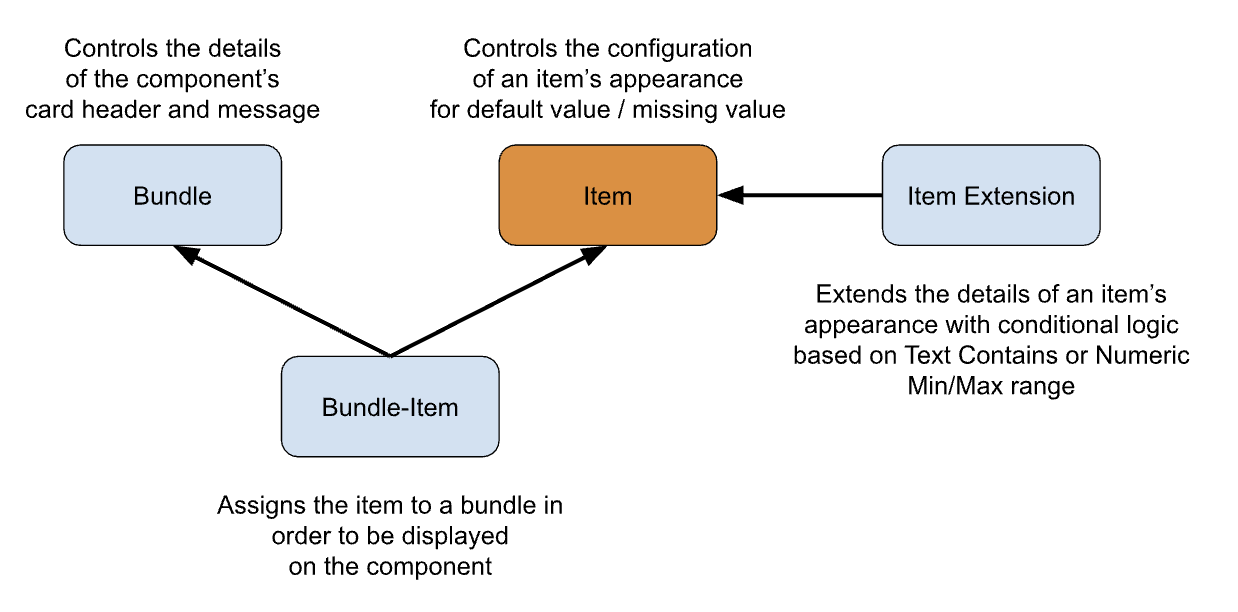
Indicator Item
An Indicator Item is setup to display an individual icon related to one field on the object. For instance, if you want to see a visual indicator to see at a glance that the Account is Active, based on the custom Account Status field.
Add a new Indicator Item
- Go to the Indicators Setup Tab
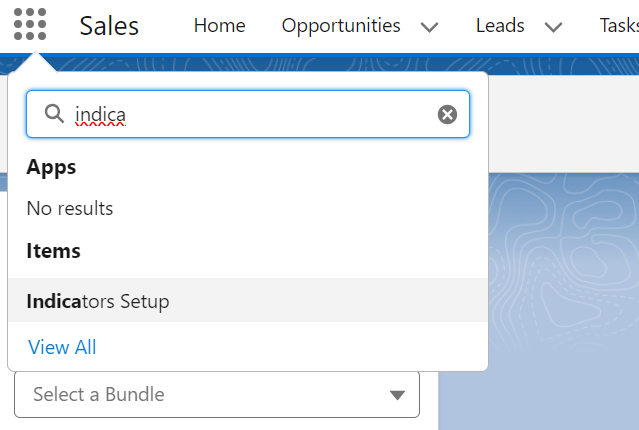
💡 If you don’t see the Indicator Setup Tab, then ensure you have granted your user the correct Permissions.
- Open the Indicators Setup Menu
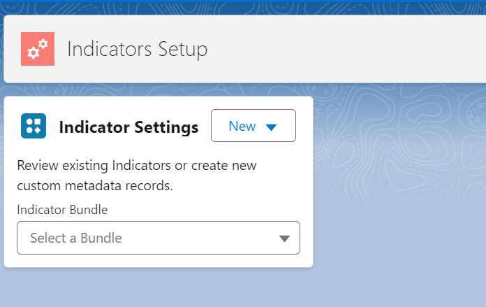
- Use the New button to add a new Indicator Item
Edit an existing Indicator Itrem
- Go to the Indicator Settings Tab
- Choose the Indicator Bundle that the Indicator Item is on (or the Item will be in Unbundled Items if the Item is not on a Bundle yet).
- Click the Edit Indicator button
OR, alternatively:
- Edit the Settings in CMDT:
- Navigate to Salesforce Setup > Custom Metadata Types
- Scroll to Indicator Items, and click Manage Records
- Click Edit next to the Item you want to edit
Indicator Item Fields
| Field | Example Value | Description | Tip | |
|---|---|---|---|---|
| Label | Contact Mobile |
Give it a descriptive name | Include the Object Name | |
| Indicator Item Name | Contact_Mobile |
The API name | ||
| sObject | Contact |
Choose the Object whose values this Indicator references | ||
| Field | Mobile Phone |
Choose the Field whose values this indicator references | ||
| Advanced Field | To use a field from a record higher in the parent-child relationship, directly enter the spanning fields (up to 5 level away). Example: Contact.Account.Owner.FirstName |
|||
| Active | true |
Leave this unchecked until the Indicator is ready to be added to a Bundle | ||
| Description | If the Contact's Mobile is Entered the icon will show |
Write something useful here, your future self will thank you | ||
| Show when False or Blank | false |
Should this indicator display anything when the field is false or blank? | ||
| Display Multiple | When Multiple Extensions are configured, instead of showing only one Icon based on the Priority order, show all Extension Icons connfigured. See Extensions for more details. | |||
| Hover Text | The Contact has a Mobile Phone No. entered |
Text to display when the user hovers over the icon | Leaving the Hover Text blank will show the field value as the hover text | |
| Inverse Hover Text | The hover text when the indicator is false or blank | |||
| Static Text | Text to display instead of a field value, icon, or image URL (only the first 3 characters or emojis will display) | Copy and paste Emojis here for some fun Indicators | ||
| Inverse Static Text | The static text to use when false or blank | |||
| Empty Static Text Behavior | Choose an option to use in place of static text, when indicator is false or blank | Default is Use Icon Only which will show the Icon if there is no Static Text entered. This field controls both regular and Inverse selections. Note: When using an Image this field is not used |
||
| Icon Value | custom:custom28 |
The Lightning Design System icon when being used instead of Field, Text, or Image URL. Get Icons from from https://lightningdesignsystem.com/icons/{:target=”_blank”}. Enter the full category and icon name like custom:custom32 |
If Static text is entered, the Icon color will be used, with the static text in white | |
| Inverse Icon Value | The Lightning Design System icon when being used instead of Field, Text, or Image URL for false or blank values | |||
| Image | The URL to the image of the Indicator when being used instead of Field, Text, or Icon | eg link to a Static Resource, File, or Document in your Org | The use of an Image overrides any Icon settings | |
| Inverse Image | The URL to the image of the Indicator when being used instead of Field, Text, or Icon for false or blank values | |||
| Zero Value Handling | How to treat Zeros (as blank or number) | Use in conjunction with Show when False or Blank |
Setup Tips
- See the Examples and Recipes in this documentation for ideas on how to use these settings
- Zero Value Handling with the setting of
Treat Zeros as Blanksworks great for DLRS or NPSP Rollup fields where the field value will always be 0 or more. eg Count of Open Opportunities for an Account used in an Indicator to show that the Account has Open Opportunities.- When using Extensions the Configuration section can be left blank
Design Tips
- Don’t use Icons that are in use in your Salesforce org elsewhere. Eg if you have Field Service installed, then don’t use the
standard:service_creworstandard:service_crew_memberon Contact, as that will be confusing.- Don’t be too literal - just pick an icon that looks good, or use a few characters instead of the Icon. Your users will get used to which icons mean what, and they have the hover text to help them know what the icon means.
- Don’t get too colorful - you can really make a mess. But use specific brand icons or colors for different brands in your company for example.
More Information
- See Icon Tips for more Icon ideas and tips.
- See Icon Colors for tips on creating colorful icons.
- See Fields and Formulas Tips for tips on creating new Fields to use in your Indicators.
Rules
In Progress
This section needs to be expanded upon.
- The indicators work with Boolean or Text fields.
- Date Fields can be used if you enter Static Text as the value that is shown does not make much sense.
- Number fields can be used as the value on the Indicator, if the number is not too big, or you use Static Text.
- If the field is a Boolean and the value is False the Indicator will not show unless Show When False or Blank is checked an an Inverse Icon Value is entered for that Indicator.
- If the field is a Boolean and there is a value in Static Text then that text will show. Limit this text to 3 characters max, and Uppercase.
- If the field is a Boolean and there is no value in Static Text the Icon will be shown.
- If the field is a Text field and there is no value in Static Text the first 3 characters of the field value will show, in Uppercase.
- If there is Static Text, the Icon image will not be shown, but the colour will be from the Icon Value entered.
- If there is a value in Image that image will show. Use Inverse Image to show Images for False values.
- Image will take precedence over Icon Value
- There is no field validation to ensure you don’t use a combination of entries that look weird, so if it looks strange, just go back to simple Boolean or text fields.
Known Issues
- SLDS Action Icons eg
action:checkdo not render in the Indicator Component correctly. Action Icons are not designed for usage in Salesforce Avatar which is what the Indicators are based on.
Next Steps
- Add Optional Extensions
- Add the Indicator to a Bundle using Indicator Bundle Items